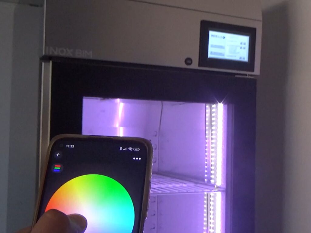
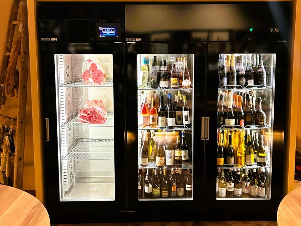
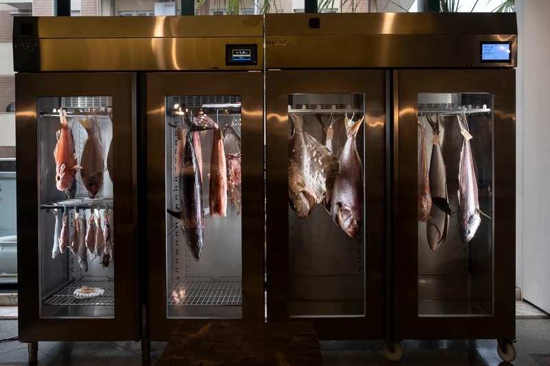
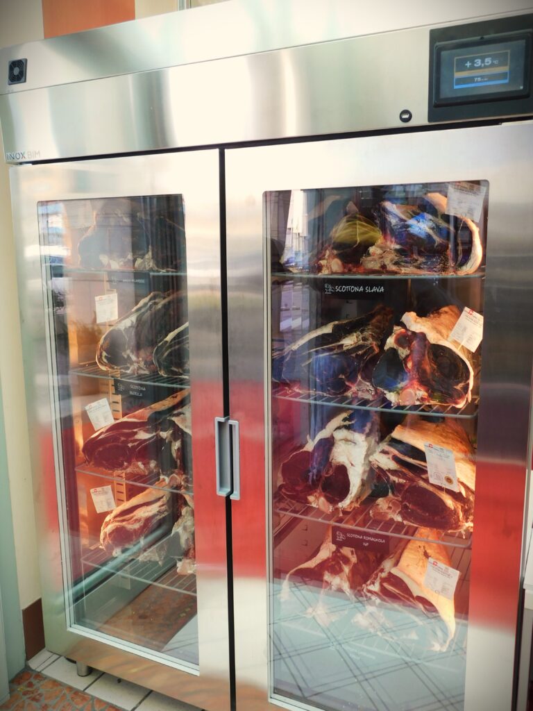
There are several scientific studies that demonstrate how the palatability of foods also depends on the light used when they are exposed.
To be specific: on the color temperature of the light, which is normally expressed in degrees Kelvin (K).
One study in particular is very explanatory of the issue: “Bon Appétit! An investigation about the best and worst color combinations of lighting and food”, published by a team of South Korean researchers in the Journal of Literature and Art Studies, in 2012 (downloadable HERE)
This states two very important points regarding the topic:
1) lighting with very low purity (that is, a non-vivid and non-monochromatic color. An example is “white lighting with nuances”) is overall preferred.
2) when both food color and lighting color are similar, the lighting color generally stimulates appetite.
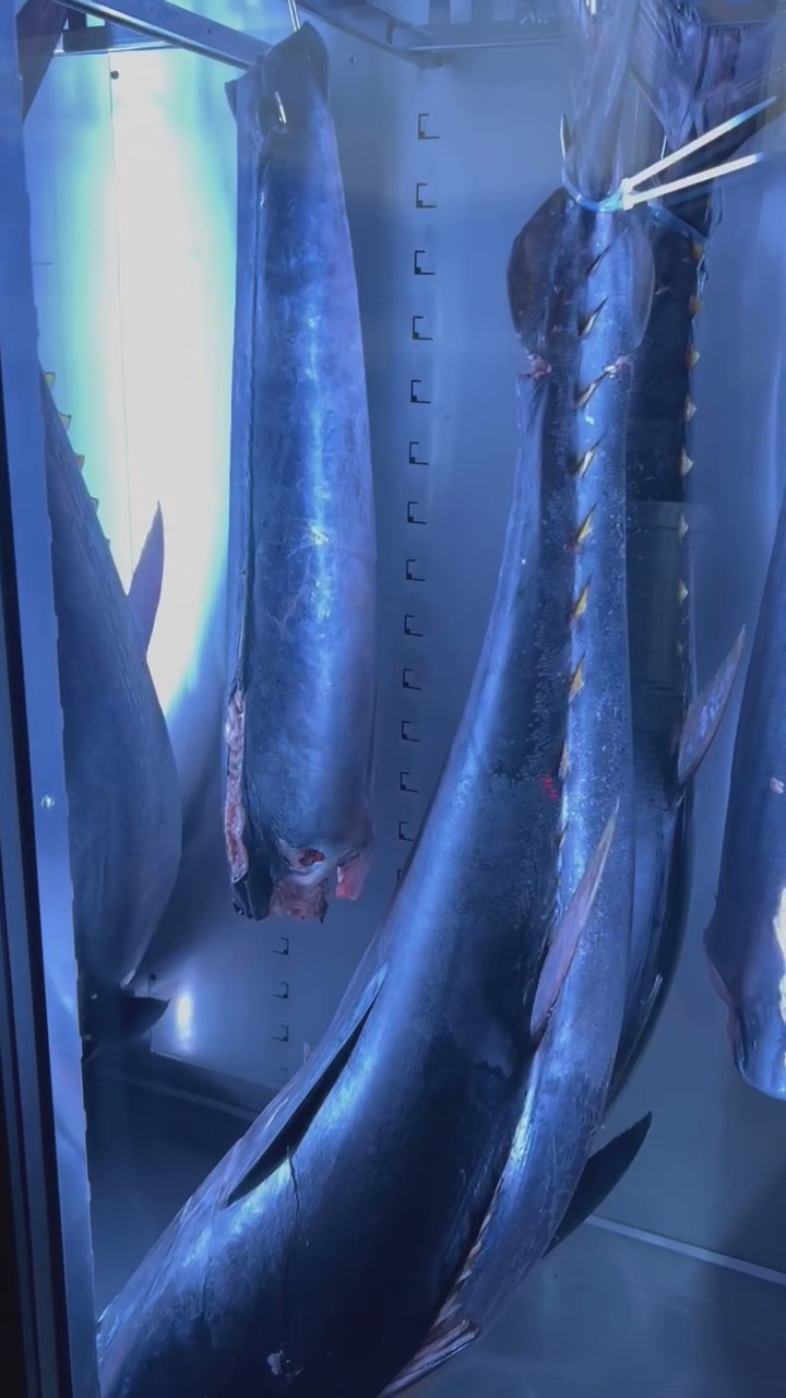
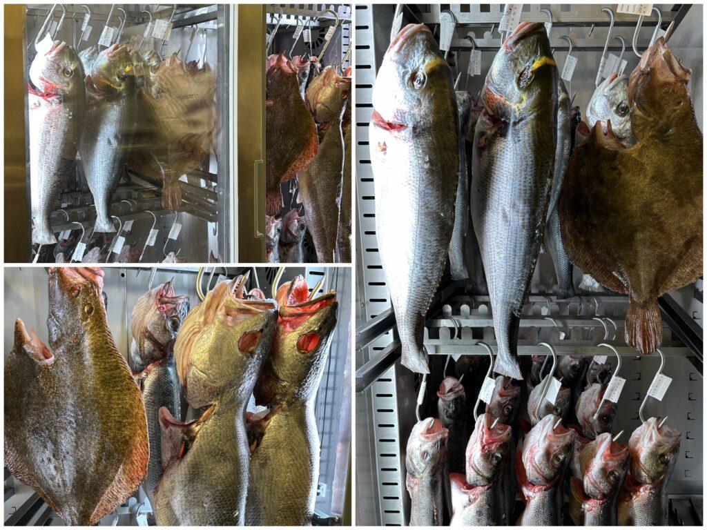
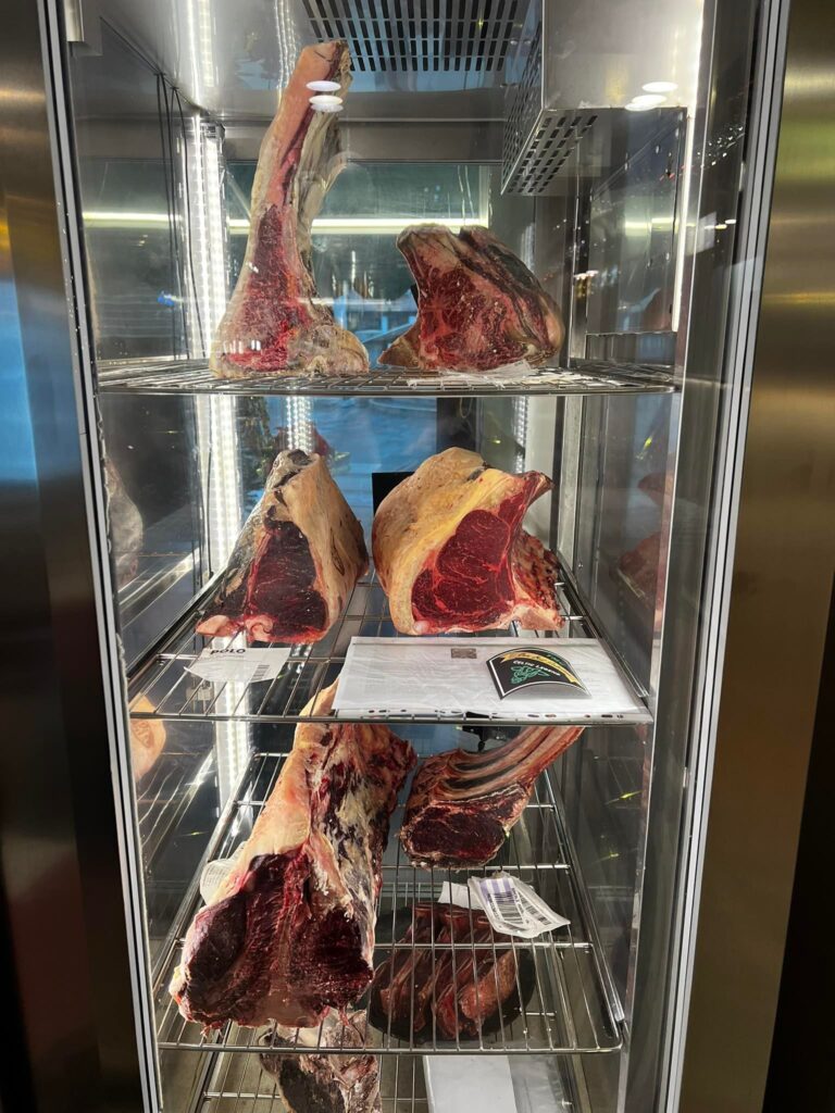
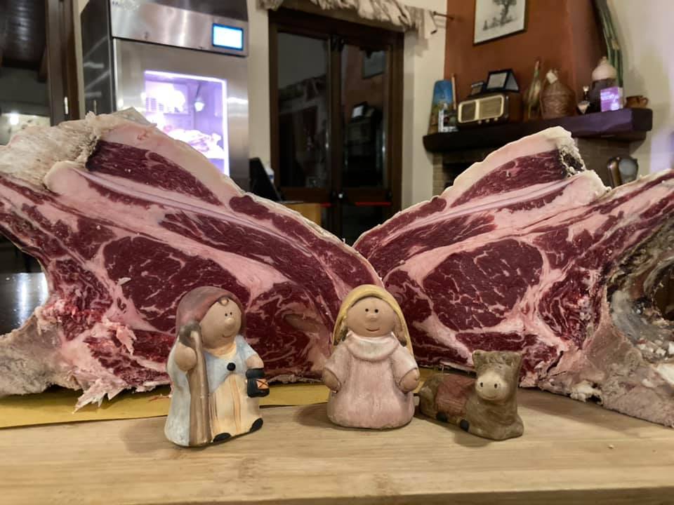
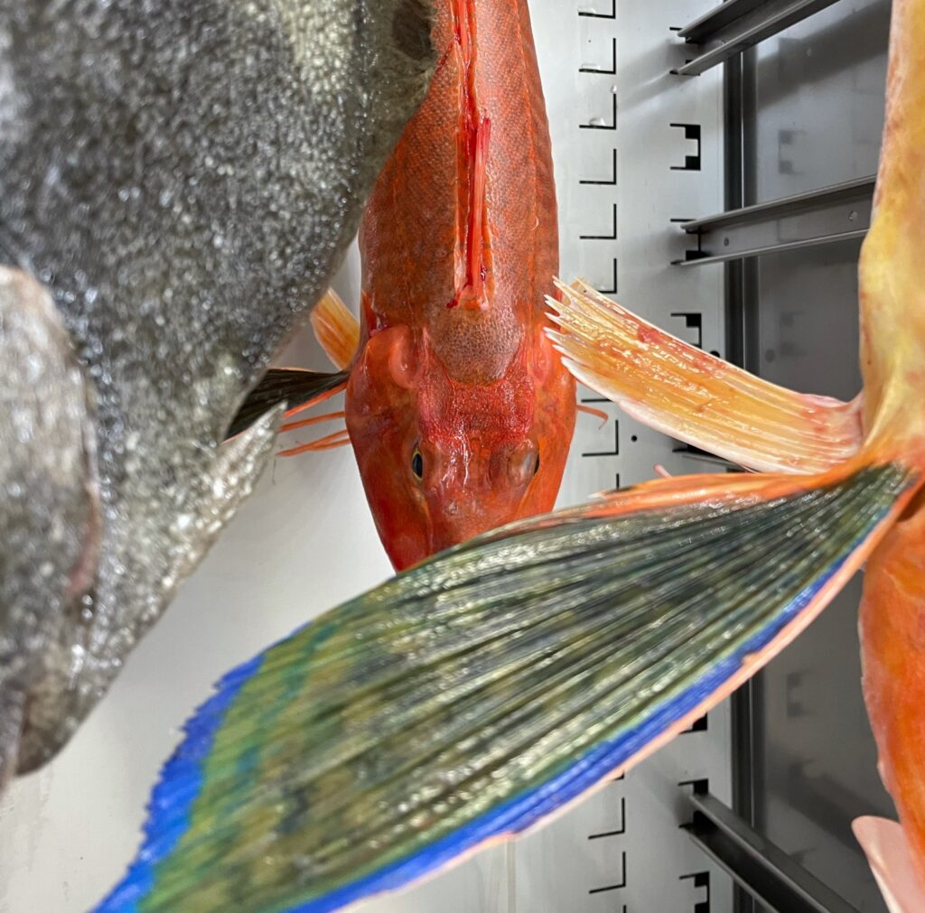
This is why shades tending towards dark red are suggested for meat, shades tending towards yellow for bread and bakery products, and light blue for fish.
This last one is exactly the case we see in the video!
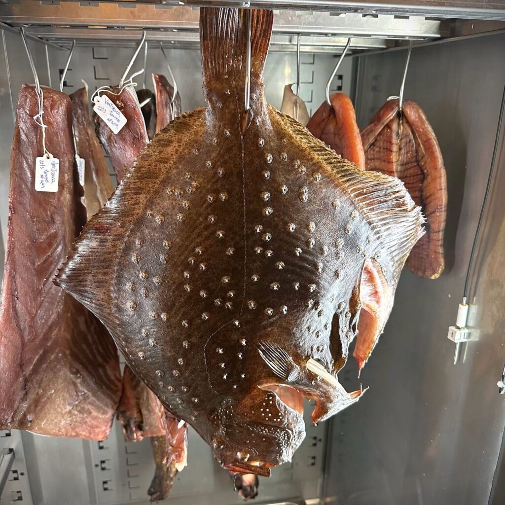
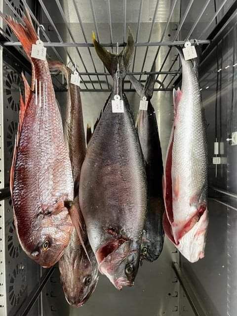
The restaurant is BOWA from Dubrovnik (Croatia): the fish is a Bluefin Tuna.
Displayed while aging in a Inox Bim climatic cabinet.
It is delicious to eat, but also beautiful to look at.
Let alone with this lighting!

 Italiano
